Melbourne ecommerce theme - Creating a banner on your home page
From Spiffy Stores Knowledge Base
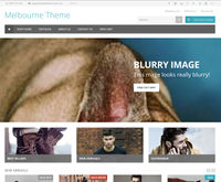
The home page features a banner image and caption that allows you to feature special promotions, with a link deeper into your store. The banner uses a parallax effect, and you'd generally want to use an image that's blurry or subtle so it doesn't affect the overlaid text.
The banner area resizes for different devices, and looks gorgeous on tablets and phones IF you use the image size detailed below.
Edit your banner in the Design & assets -> Theme editor section of your store's Toolbox. There you can upload new images, and enter captions and links. This can be found in the Home Page - Featured Links section.
Editing your parallax banner
Edit your parallax banner in the Design & assets -> Theme editor section of your store's Toolbox. Scroll down on this page until you find the section called Home Page - Banner Area.
It's a good idea delete the demo images, captions, and links that are currently there before you start to upload your own images.
You will find the following fields...
- Display Banner Area? - Ticking the box will display the banner area on your home page.
- Upload image - To upload an image, click the "Choose file" button, and select the image on your computer. Make sure your images are 2048px wide x at least 900px high or they will be chopped off. There's a tutorial on this page with step by step instructions on getting your images the correct size.
- Title - The title appears as an overlay on your image. You should preview it to make sure you haven't written too much text. This field accepts text only. Entering HTML here may have unpredictable results. If you don't want a title, or have included the text you want in your image, you should leave this field blank, and the title will not appear.
- Caption - The caption appears underneath the title in your banner. You should preview it to make sure you haven't written too much text. This field accepts text only. Entering HTML here may have unpredictable results. If you don't want a caption, or have included the text you want in your image, you should leave this field blank, and it will not appear.
- Link - If you want your banner to link somewhere, enter the page address that you want to link to. You should ALWAYS enter your links as relative URL's. To get the relative URL of a page on your store, view the page in your web browser, and copy the address of the page that's directly after your domain. e.g. if your page is at "joes-widgets.spiffystores.com/pages/blue-widgets", the relative url of this page is "/pages/blue-widgets".
When you are done editing your banner, or want to save it to view it in your store, scroll down and click the Save Settings button.
Using Pixlr to create your banner images
- Go to the Pixlr editor
- Click "Create a new image"
- Set the width to 2048 and the height to 900, and click OK
- You now have your canvas to work within. You will need to explore the various tools and options. You can open your own images in Pixlr using "File -> Open image" in the Pixlr menu. You can then copy and paste your images into your slide. You need to make sure when you're doing this, that you don't stretch your images. You can do this by holding down the shift key when re-sizing.
- When your image is looking gorgeous, save it by choosing "File -> Save" from the Pixlr top menu.
- Choose JPEG for your format, and set your quality to 80
- When you've saved the file to your computer, upload it by following the instructions above.
HELP! - My images are chopped off or blurry!!!
If your images look blurry, they were either uploaded blurry, or aren't high enough quality to be used in your store. You'll need to source higher quality images.
You will need to create your images at the correct size of 2048px wide by at least 900px high so that the parallax effect works. You can do this using most image editing programs, but many people find Pixlr useful. That's why we've included instructions above on this page on how to get your banner images the correct size :-)
You should ensure you source good quality photos, as this is the first thing your customers will see when they visit your site and set the tone of their shopping experience. Spend time to get your images looking gorgeous, as cheap looking, unprofessional or ugly images will will definitely have a negative effect on your sales.
You can also email us if you need help getting your images looking gorgeous! You will need to send your images to us attached to your email if you want any help with this.


